

AXIOMA ROOF™ SCORE HIGHLIGHTS
WEEK OF APRIL 6, 2026
Potential triggers for sentiment-driven market moves this week
- US: FOMC minutes, CPI March) and PCE (Feb.) data, Consumer Sentiment reading.
- Europe: Eurozone retail sales. Germany’s factory orders.
- APAC: China CPI and PPI data. Japan consumer confidence.
- Global: Expect more huffing and puffing before anyone actually tries to blow the house down ahead of
Monday’sTuesday’s Hormuz deadline.
Insights from last week's changes in investor sentiment:
Identifying investor sentiment is a bit like inferring the presence of an exoplanet we can’t see directly. Astronomers look for small gravitational distortions - or “wobbles” - in the paths of objects they can observe and whose orbital fields they’ve already mapped. Likewise, we can’t observe investors’ strategies directly, so to infer whether investors are positioning bullishly or bearishly, we look for comparable “distortions”: active returns in sector portfolios we can observe and whose factor exposures we’ve already mapped, classifying sectors as risk-tolerant or risk-averse. When a risk-averse sector rises as the market falls, it suggests investors are rushing to safety.
According to those “wobbles,” Global Developed ex-US investors have been implementing bearish strategies for 39 consecutive days - and counting. While that may sound like a long stretch of pessimism, our history back to January 1997 shows 14 periods in which investors remained bearish for longer than 39 days (with an average duration of 59 days).
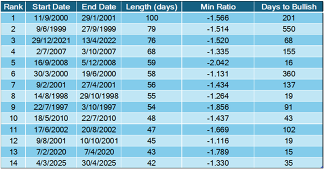
The table above records historical drawdowns in the ROOF Score for Developed ex US markets, detailing how long investors remained bearish, how low the ROOF Score fell, and how many days were required for sentiment to turn bullish again (ROOF Score >0.50).
The shortest sentiment “recovery” (15 days) came immediately after the COVID crash, following a massive, coordinated QE effort by major central banks - a feat they are unlikely to repeat in today’s inflationary environment, in the middle of a global oil shock.
Many of the market charts below show ROOF Scores that appear to have bottomed out recently, but we would caution against concluding that investors have reached peak bearishness. Much of the recent “recovery” in ROOF Scores has been driven by falling market risk rather than clear “wobbles” back toward risk-tolerant sectors. Volatility is fickle. After the “Tuesday 8PM” deadline passes - unless another (fourth) deadline is announced - volatility, and sentiment, are likely to take their cues from any attacks on the region’s oil and civilian infrastructure.
Against this backdrop, headline risk remains elevated - especially around communications from the White House.
Investors don’t believe in censorship, but President Trump’s tweets are making them believers in self-censorship. With each post, it’s as if the President were living inside a movie trailer, and this is where the Talking Heads song would fade in: “AND YOU MAY TELL YOURSELF, THIS IS NOT MY BIG BEAUTIFUL WAR”.

Note: green background = bullish, red background = bearish
Changes to investor sentiment over the past 180 days for the ten markets we follow:
How to Interpret These Charts:
Top Charts:
The top charts illustrate the ROOF ratio, which represents investor sentiment. This ratio is depicted in green on the left axis, while the cumulative returns of the underlying market are shown in black on the right axis. Key reference lines include:
- A horizontal red line at -0.5 (left axis), marking the threshold between negative sentiment (-0.2 to -0.5) and bearish sentiment (< -0.5).
- A horizontal blue line at +0.5 (left axis), indicating the boundary between positive sentiment (+0.2 to +0.5) and bullish sentiment (> +0.5).
- A horizontal grey line at 0.0 (left axis), around which sentiment is considered neutral (-0.2 to +0.2).
Bottom Charts:
The bottom charts display the levels of risk tolerance (green line) and risk aversion (red line) within the market, representing investors' demand and supply for risk, respectively. Key insights include:
- When risk tolerance (green line) exceeds risk aversion (red line), more investors are willing to buy risk assets than there are investors willing to sell them at the current price. This scenario forces risk-tolerant investors to offer a premium to entice more risk-averse investors to trade, thereby driving markets upward.
- Conversely, when risk aversion (red line) surpasses risk tolerance (green line), the market dynamics reverse.
The net balance between risk tolerance and risk aversion levels is used to compute the ROOF ratio shown in the top charts, reflecting the sentiment of the average investor in the market.
Blue Shaded Zone:
The blue shaded zone between levels 3 and 4 for both indicators signifies a reasonable balance between the supply and demand for risk in the market. When both lines remain within this blue zone, the market is considered ‘emotionally’ stable. However, when both lines move outside this zone, the significant imbalance in demand and supply for risk can lead to overreactions to unexpected news or risk events.


You may also like


