
EQUITY RISK MONITOR HIGHLIGHTS
WEEK ENDED APRIL 10, 2026
Equity highlights week ending April 10, 2026
- Volatility rose globally last week while asset correlations increased in Europe
- Market gains last week came despite – or perhaps because of - low trading volume
- Are investors “buying the dip”?
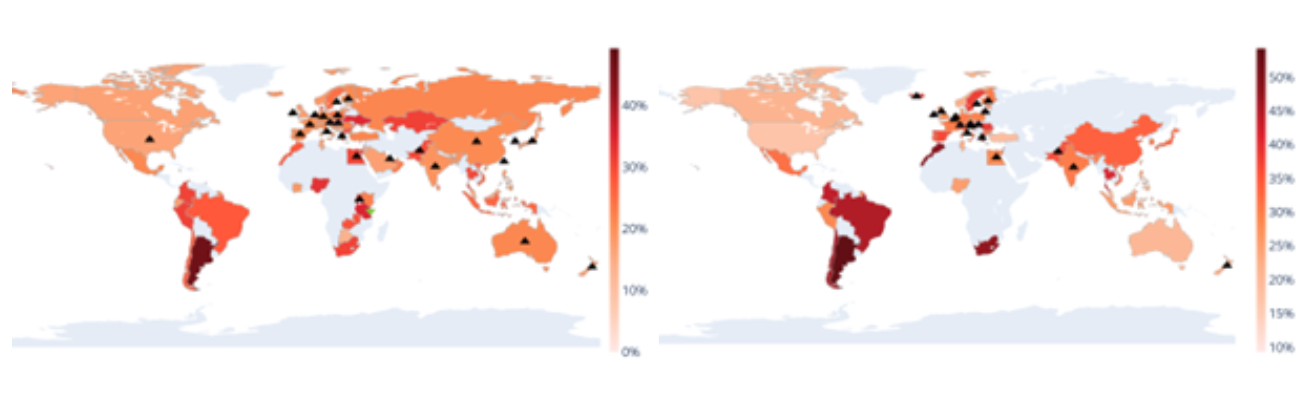
Volatility rose globally last week while asset correlations increased in Europe
Volatility took another step up last week in almost every country, even as markets rose on prospects of a cease-fire in Iran. Asset correlations within many countries increased as well, although that effect was seen in Europe more than in other regions. Latin America, where volatility was already higher than in most of the rest of the world, was spared last week’s additional climb.
Upward arrows on the Global Volatility Hotspots map below indicate that volatility for the associated country was up by more than one percentage point in the prior five days, while the arrows on the Global Correlation Hotspots chart show that the median asset correlation within the country rose by at least 0.02.
See charts from all Equity Risk Monitors as of April 10, 2026
Global Volatility Hotspots (Left) and Global Correlation Hotspots (Right)
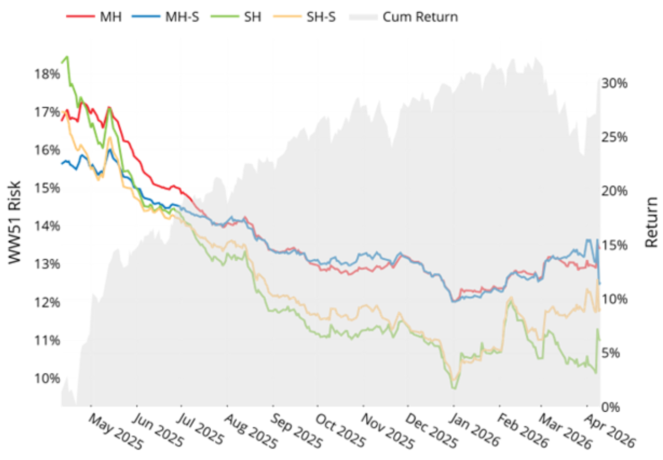
According to the Axioma WW5.1 (Worldwide) model, predicted risk for the STOXX Global Developed Index jumped at the outset of the war with Iran (about 2% proportionally1 for the medium-horizon variants and 4%-6% at the short horizon). We saw little change in risk forecasts for the next several weeks, until April 8, when Israel attacked Lebanon and Iran paused traffic in the Strait of Hormuz. On that day medium-horizon risk was up 4%-5% proportionally and short-horizon risk rose as much as 11% before settling back down in the following days. While it is surprising that predicted volatility has not risen more given the heightened uncertainty, especially around oil prices, we believe the small-but-steady market declines in March followed by the gradual daily upturn in prices, all accompanied by continued low asset-asset correlations explains the relatively muted effect on risk. Asset correlations have started to rise very recently and therefore the rising level of risk may not be over yet. In fact, 20-day correlations are just under the level of a year ago…
…and risk remains well below the levels reached a year ago as a result of “Liberation Day”, when the shock to the system driven by dramatically higher tariffs on almost every country in the world led to bigger close-to-close market declines (already largely done by the time the following chart starts). In addition, as tariffs were widespread and it was difficult to see the immediate benefit for any company, asset-asset correlations jumped dramatically then as well. As the US administration rolled back the overall tariff level predicted volatility started to fall, bottoming at levels well below the long-term median.
See chart from the WW5 & STOXX Developed World Equity Risk Monitor as of April 10, 2026
STOXX Developed World – Predicted Risk
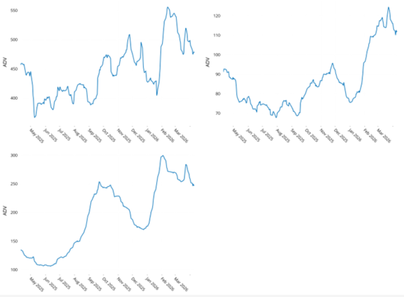
Market gains last week came despite – or perhaps because of - low trading volume
Rolling 20-day average daily trading volume has fallen substantially since the initial jump at the beginning of the war, especially in the US. Even last week’s strong gains did not seem to draw in more investors.
We believe that the market strength accompanied by low volume suggests a relative lack of support; lower volume means a given trade will have a bigger impact on prices. And of course, that can work both ways. Recent gains based on some investors’ optimism about the end to the war can easily become losses if we do not actually see an end.
See charts from the US, International Developed Markets and Emerging Markets Equity Risk Monitor as of April 10, 2026
Rolling ADV (USD Billions)
STOXX US (Left), STOXX International Developed Markets (Right) and STOXX Emerging Markets (Bottom)
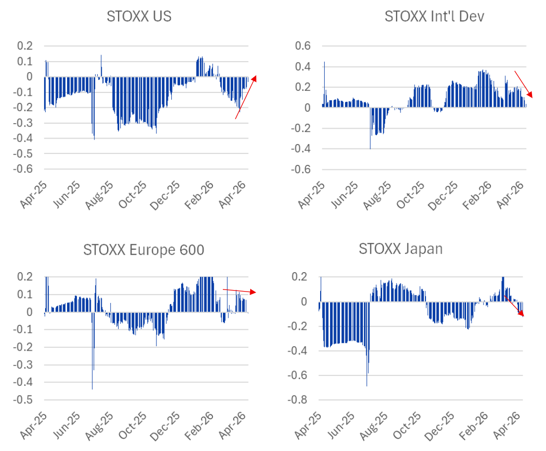
Are investors “buying the dip”?
Paradoxically, one behavior on the part of investors that could drive volatility up is the tendency to “buy the dip.” The sawtooth pattern of a market that is down one day, up the next, etc. would lead to higher volatility as compared with a market that ratchets steadily up or down. We looked at a very simple measure – a 60-day serial correlation of daily returns – as a shorthand measure of the strategy. If the correlation is negative or falling, it suggests that investors are buying after a down market (or, of course, selling after the market is up), whereas if it is positive or increasing (so the correlation is getting less negative) we may be seeing more persistence in market returns in one day to the next. This is a concept we first introduced last fall in the weekly highlights as of November 14, 2025.
Charts for the last 12 months of 60-day rolling serial correlations show that US investors were buying after the market was down (and selling after the market was up) for most of the past 12 months; that seemed to be the harbinger of success in tech stocks in particular. More recently, however, the serial correlation has gotten successively less negative, suggesting that investors are abandoning that strategy and possibly one more reason that market volatility has not risen as much as it has in other markets.
For Developed Markets ex-US the serial correlation was positive for most of last year, but that correlation has declined over the past couple weeks – could be that the see-sawing is happening from US to non-US stocks and vice-versa. Similarly, the serial correlation of returns in the Japanese market has turned negative since the beginning of April, and investors may therefore be seeing opportunity as the market has dipped (and Japan has seen a substantial increase in its volatility). In Europe, the correlation flipped from negative to positive early in 2026, and has generally flattened out in the past few weeks.
This is by no means a perfect measure of whether investors are buying the dips and the back-and-forth is driving volatility, but it is a simple measure that can provide a bit of insight.
The following charts do not appear in the Equity Risk Monitors but are available on request:
Serial correlation of market returns for the past 60 days, rolled ahead day by day
You may also like


